
Spring Sale Landing Page Design Ideas for 2026

Last Updated: November 8, 2026
Quick Summary
A spring sale landing page works best when it does one job well: it names the sale, presents a single clear message and makes the next step obvious. Pairing soft seasonal imagery with a simple layout helps visitors understand the deal within seconds of arriving.
Name the sale and main benefit in the hero section.
Use soft botanical imagery but keep the product front and centre.
Group products by concern, such as hydration, calm or repair.
Keep the page uncrowded and avoid too many banners.
Design for mobile first, with large tap targets and a sticky Shop All button.
Table of Contents
Spring Sale Landing Page Examples That Work
A spring sale landing page should do one job well: get a shopper to the offer and make the next step obvious. A strong spring sale page pairs fresh seasonal colour with a single clear message, so a visitor understands the deal within a few seconds of arriving.

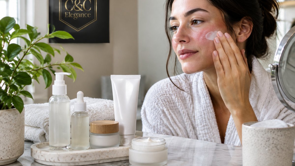
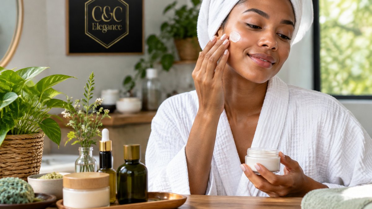
Start with a hero section that names the sale and the main benefit. Use soft botanical imagery, such as blossoms or fresh greenery, but keep the product front and centre.
Keep the layout simple. Group products by concern, such as hydration, calm or repair, so shoppers can find their match quickly. Avoid crowding the page with too many banners.
The core points for a spring sale landing page are summarised below.
Element | What to do | Why it matters |
Hero section | Name the sale and main benefit | Visitor understands the deal within seconds |
Imagery | Soft botanical visuals, product front and centre | Seasonal feel without hiding the product |
Layout | Group products by concern | Shoppers find their match quickly |
Banners | Keep the page uncrowded | Avoids distracting from the offer |
Landing Page Headline Examples for a Spring Sale
Your headline should name the offer and the benefit in plain words. Shoppers skim, so short headlines win.
"Spring Refresh: Plant-Based Skincare, Now on Sale"
"Renew Your Routine This Spring"
"Gentle Care for Sensitive Skin, Spring Savings Inside"
Testing two or three headlines against each other can show which wording gets more visitors clicking through to the collection. You can also read spring sale marketing ideas for small businesses to connect the landing page with wider promotion.
Ecommerce Landing Page Best Practices and Mobile Design
Most spring shoppers browse on their phones, so design for small screens first. Use large tap targets, short product descriptions and a sticky "Shop All" button so the next step is always within reach.
Keep your calls to action clear and consistent. Place them near the top of the page and repeat them after each product group.
For guidance on planning the wider promotion, see How to Plan a Spring Sale Promotion That Sells. Our range of hair care and face care is a useful place to start building a seasonal selection.
At C&C Elegance, our formulations are PhD-led and made with 100% plant-derived, vegan and cruelty-free ingredients, free from synthetic chemicals and artificial fragrances. Shop All to explore our collection this spring.
Frequently Asked Questions
What should a spring sale landing page include?
A spring sale landing page should open with a clear headline naming the offer, a hero image that reflects the season, and a visible call to action such as Shop All. Add the offer deadline, a short product grouping of your best spring lines, and a few trust signals such as customer reviews and the formulation background. Keep the page focused on one offer so shoppers can scan it quickly on any device.
How do you write a strong landing page headline?
A strong headline states the benefit and the offer in plain words, for example 'Spring Renewal Sale: Plant-Based Skincare for Sensitive Skin'. Keep it under about ten words, match the wording of the ad or email that brought the shopper in, and support it with a one-line subheading that explains who the products suit. Test two or three versions to see which one keeps visitors reading.
How can you make a landing page work well on mobile?
Most shoppers browse on a phone, so place the headline and main call to action above the fold and use large, tappable buttons. Compress product images so the page loads quickly on mobile data, and keep forms short. Check the layout on a range of screen sizes before the sale starts, because a slow or cramped page loses sales during promotions.

Comments